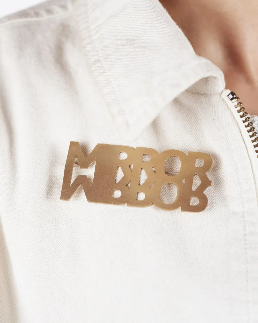
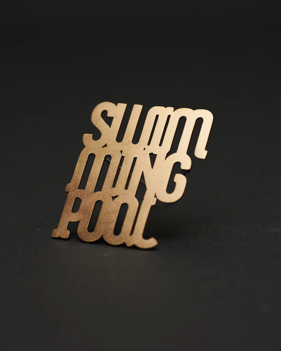
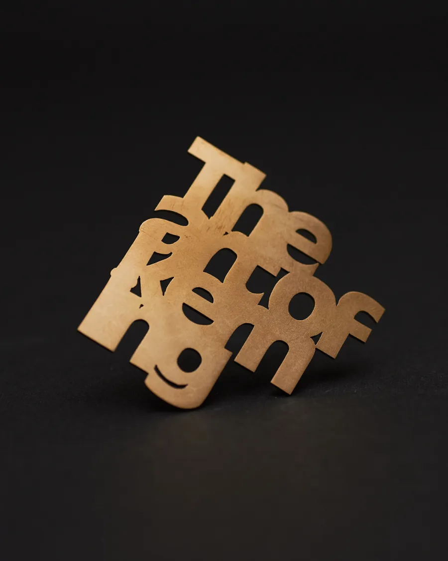
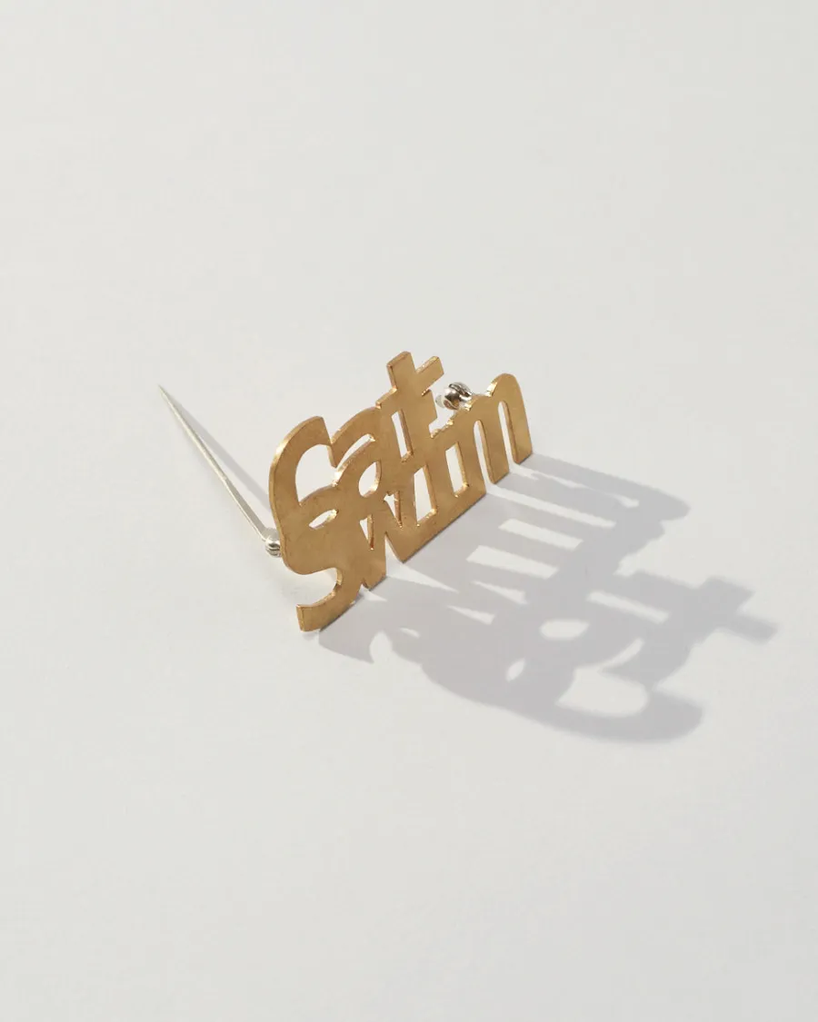
TYPO Brooch
Brass Brooches — Hidden Messages Found in the Space Between Letters
Letters as Form, Not Information
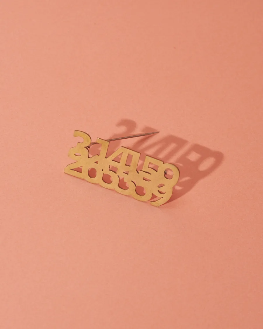
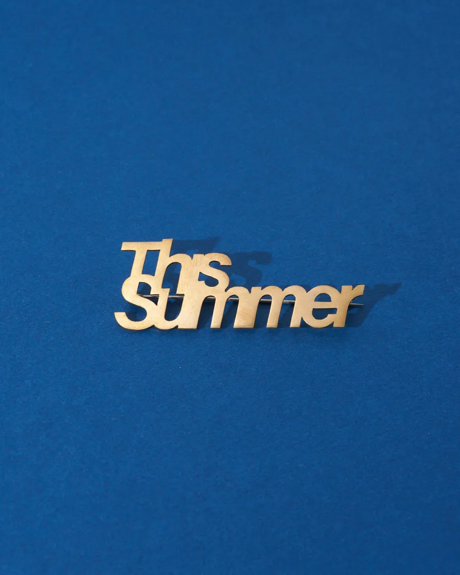
Every day we are surrounded by an enormous volume of text — read quickly, absorbed, discarded. But what happens when letters are freed from their role as carriers of meaning and treated purely as shapes? TYPO is a collection of brass brooches that reinterprets typography from a visual and sculptural perspective. The alphabet is deconstructed: letterforms are reshaped, and the spacing between characters is redesigned to create compositions that read first as abstract geometric forms. Look closer, and words begin to surface.
That delayed discovery — the moment of recognition — is central to TYPO. From a distance, the brooch appears as a clean, modern brass object. Then, gradually, the eye picks apart the shapes and a message reveals itself. This time-lag between seeing and reading creates a quiet exchange between the wearer and anyone who notices.
字間 and 行間 — The Space That Makes Language Visible
In Japanese typography, two terms describe the spaces that give text its rhythm: jikan (字間), the space between individual characters, and gyoukan (行間), the space between lines. These are not empty gaps — they are what make reading possible. Without jikan, characters collapse into each other. Without gyoukan, lines blur into a wall of ink. The meaning lives not in the characters alone but in the intervals between them.
This is another expression of ma (間) — the Japanese concept of meaningful pause or interval. In architecture, ma is the open space in a room that gives the room its character. In music, it is the silence between notes. In calligraphy, it is the space surrounding each stroke. TYPO applies this idea to the Latin alphabet: by manipulating the space between letters — expanding, compressing, rearranging — the design turns spacing itself into the subject.
Hand-Cut from Brass — Wearable and Self-Standing
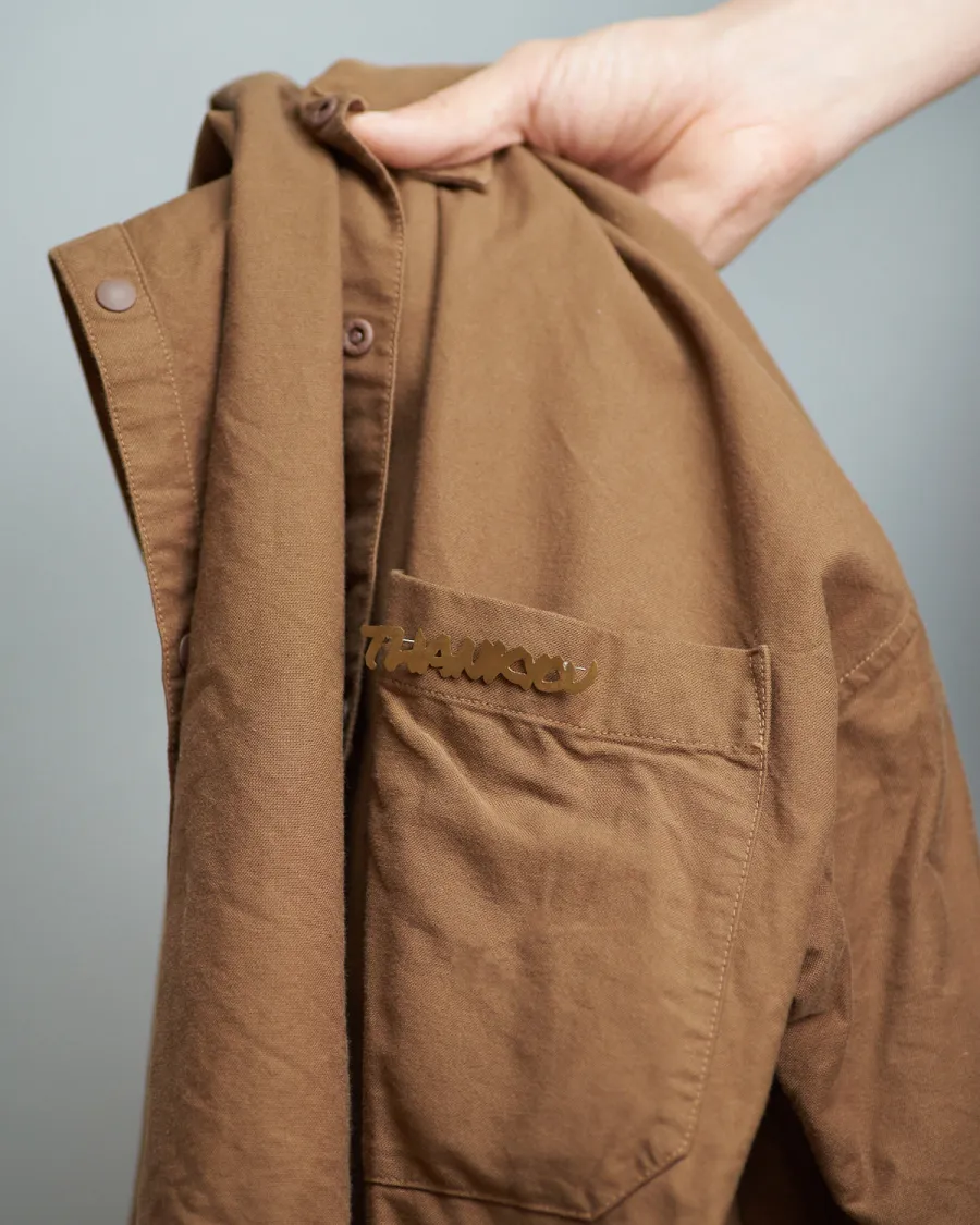
Each TYPO brooch is handcrafted by us in our Tokyo studio from brass sheet — cut, filed, and polished by hand. The brass has a warm, soft luster that pairs with almost any fabric or color.
TYPO has a second function: by unfolding the pin clasp on the back, the brooch stands upright on its own. After wearing it out, it can sit on a desk, shelf, or windowsill as a small object. This dual quality — wearable jewelry and freestanding display piece — is built into the design. The still, upright posture of a standing TYPO brooch reflects the quiet presence of typographic characters themselves: forms that hold meaning without making noise.
A Message Worn Close
TYPO comes in three sizes — L, M, and S — each carrying different letter compositions. The brass surface develops a deeper amber patina over time through contact with air and skin, gaining character with wear. As a piece that holds words within its form, TYPO works well as a gift — a way of giving someone a message to carry without saying it out loud.
Related Articles
PRISMA Earrings
PRISMA|Unique glass earrings where intricate cuts draw out layers of light
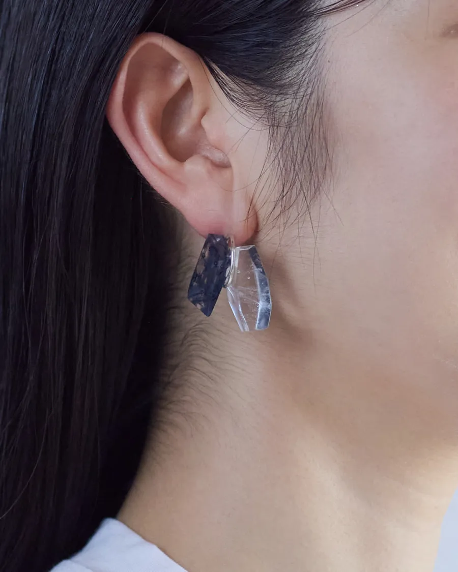
CAIRN Earrings
CAIRN Earrings | Layers of Light at Your Ears

DRIP Pendant
Pate de Verre Glass & Silver — Capturing a Moment of Liquid Suspension
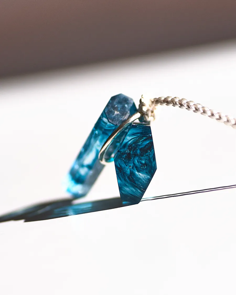
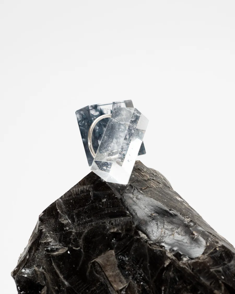
CAIRN Pendant Vol.2
CAIRN Pendant | Pendant with Two Faceted Glass Elements and Silver Ring
CAIRN Pendant — The Story Behind the Stone Markers
Why We Named a Glass & Silver Pendant After an Ancient Trail Tradition
INWATER Collection
INWATER|Glass jewelry like being underwater, where clarity and murkiness overlap